Color matters! For you personally and for your website visitors. In fact, it matters more than you think!
Growing up I was real trouble maker, just like any normal kid I suppose. Inevitably, I was summoned by my father to get the “Marine Corp” belt. The belt was out in the garage, you know, the unfinished, exposed wood part of the garage before we used to make a garage a bedroom for our cars. Hanging on a rusty bent nail, pounded into a 2×4, was the Marine Corp Belt. The buckle was worn out brass, very utilitarian in design and the actual belt was well warn leather. This belt was in World War II on my father’s waist, and now it was about to be on my butt…and I had to go get it! As it turns out, my father never hit me with it, he would fold it in half and snap it only as he could do. The shrill from that snap would send the dog running one direction and me the other!
What does this have to do with color?
Quite simple, I’ve never been a big fan of brass colors and warn-out leather colors! Get it now? Color moves us. You can show me a painting of the highest price and beauty; if it is brassy and leathery in color I will say…naaaaaaaaaa, not so much! Color really does matter and we take it quite seriously when we build a website. We often show first comps in black and white, so that the client can see the overall composition and layout without having the color get in the way. Color is poignant, it really does moves us!
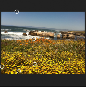
So, how do you arrive at a color scheme for your website? Which colors work together and which do not? There are a few interesting ways to develop a color palette for your site. One involves using a nice photograph, as is the case to the right, Mother Nature.
 Take this picture on the right for example. I took this recent on a trip to Morro Bay California. The color is fabulous. This moves me and a get some amazing comments from others that see it. What if we wanted to use this color theme for a website? How would we develop a palette from this picture? Would it be acceptable for a therapists website, a dentists website, a photographers website, a financial website?
There is a psychology to color and you should be aware of this psychology when developing your site. Here are a few comments with regards to some popular colors.*
Black
Black is the color of authority and power. It is popular in fashion because it makes people appear thinner. It is also stylish and timeless. Black also implies submission. Priests wear black to signify submission to God. Some fashion experts say a woman wearing black implies submission to men. Black outfits can also be overpowering, or make the wearer seem aloof or evil. Villains, such as Dracula, often wear black.
White
Brides wear white to symbolize innocence and purity. White reflects light and is considered a summer color. White is popular in decorating and in fashion because it is light, neutral, and goes with everything. However, white shows dirt and is therefore more difficult to keep clean than other colors. Doctors and nurses wear white to imply sterility.
Red
The most emotionally intense color, red stimulates a faster heartbeat and breathing. It is also the color of love. Red clothing gets noticed and makes the wearer appear heavier. Since it is an extreme color, red clothing might not help people in negotiations or confrontations. Red cars are popular targets for thieves. In decorating, red is usually used as an accent. Decorators say that red furniture should be perfect since it will attract attention.
The most romantic color, pink, is more tranquilizing. Sports teams sometimes paint the locker rooms used by opposing teams bright pink so their opponents will lose energy.
Blue
The color of the sky and the ocean, blue is one of the most popular colors. It causes the opposite reaction as red. Peaceful, tranquil blue causes the body to produce calming chemicals, so it is often used in bedrooms. Blue can also be cold and depressing. Fashion consultants recommend wearing blue to job interviews because it symbolizes loyalty. People are more productive in blue rooms. Studies show weightlifters are able to handle heavier weights in blue gyms.
Green
Currently the most popular decorating color, green symbolizes nature. It is the easiest color on the eye and can improve vision. It is a calming, refreshing color. People waiting to appear on TV sit in “green rooms” to relax. Hospitals often use green because it relaxes patients. Brides in the Middle Ages wore green to symbolize fertility. Dark green is masculine, conservative, and implies wealth. However, seamstresses often refuse to use green thread on the eve of a fashion show for fear it will bring bad luck.
Yellow
Cheerful sunny yellow is an attention getter. While it is considered an optimistic color, people lose their tempers more often in yellow rooms, and babies will cry more. It is the most difficult color for the eye to take in, so it can be overpowering if overused. Yellow enhances concentration, hence its use for legal pads. It also speeds metabolism.
Purple
The color of royalty, purple connotes luxury, wealth, and sophistication. It is also feminine and romantic. However, because it is rare in nature, purple can appear artificial.
Brown
Solid, reliable brown is the color of earth and is abundant in nature. And my dads Marine Corp Belt! Light brown implies genuineness while dark brown is similar to wood or leather. Brown can also be sad and wistful. Men are more apt to say brown is one of their favorite colors.
Red may not be the most appropriate color scheme for a trauma psychologist for obvious reasons, toned down cool and calming colors would be. The point here is important, think of your audience too! Think of what emotions will be touched when they see your site and the colors presented.
Back to our picture of Morro Bay.
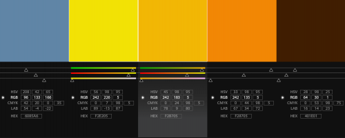
 Let’s take this picture and extract the color to build our site color palette. In this example, I be the owner of a photo studio and we feel that this picture represents out office color theme and would be a wonderful base for our site. The first step is to pull out meaningful colors from the image. You can see that we have circled a few areas that we would like to use the color. With these colors extracted we can build a color strip that we will use for various elements of the website. Background, text titles, sidebar background, header, footer color…all together will make a beautiful theme.

Take a look at the color chip that is developed from the image. Now we can use these colors for the various elements and build a site color palette that emulates the image that we started with. This can be used for all aspects of our business. Corporate identity, office design, marketing collateral, etc. This is marketing 101 and out of the scope of this article, but know that a uniform look and feel across all visual communication is so important.
What is I don’t have a nice picture but I know what colors move me?
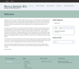
Recently one of our clients wanted to create a site with a custom color theme that suited her desires and would be appropriate for a Therapist site. I talked to her about her color preferences and what colors she felt would move her patients. We settled on “beiges, blues, and greens in water color style”. Below you will see the color strip we created and an actual page from the clients website.

As you can see we used all aspects of the color theme on the final site. Other pages included more color integration, the final outcome was a design that delighted the client.
Parting words
Color does matter! Color is equal in importance to other site elements such as design layout, navigation logic, and of course good content. The sum of these parts makes a whole website. Consider each element with great care, your audience and your bottom line will thank you for it!
*Source: Color Psychology — Infoplease.com
Color exploration by Kuler

